What if switching your website’s theme felt less like a jarring toggle and more like a cinematic transformation of the current view?
Modern users crave interfaces that feel fluid and alive. Most light/dark mode transitions are abrupt. This sudden flash of pixels often breaks the user’s immersion.
The modern View Transition API changes this by bridging the gap between static DOM states. It allows us to choreograph seamlessly animated transitions between page views with just a few lines of CSS and JavaScript.
In this post, we will move beyond the basic toggle. I will show you how to turn a standard UI necessity into a delightful, polished experience. We will build an app showcasing various ways to make theme transitions a joy to watch.
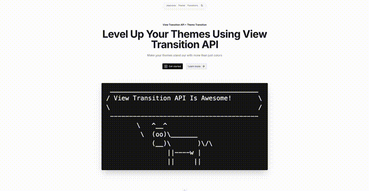
Demo Project Preview
Take a look at the transition below. This is just one of the many cinematic effects we are going to craft in this guide.
Pretty cool, right? Compared to the instant, jarring “snap” of a typical dark mode switch, this feels intentional and incredibly fluid. It is a small detail that makes a massive difference in how a user perceives your app’s quality. We will move beyond basic toggles to turn simple theme changes into standout features that capture user attention.

Project Setup
Installation
To establish a solid foundation, we are using Nuxt alongside NuxtUI. This combination provides a library of polished components that support theming out of the box. Conveniently, Nuxt offers several starter templates to scaffold projects quickly, including a dedicated setup for NuxtUI.
$ npm create nuxt@latest -- -t uiTheme Configuration
Once the installation is complete, we are ready to dive in. NuxtUI provides an intuitive way to define your visual style before you even write a line of code. Use the documentation’s theme palette to customize properties. You will see instant changes across all component previews.
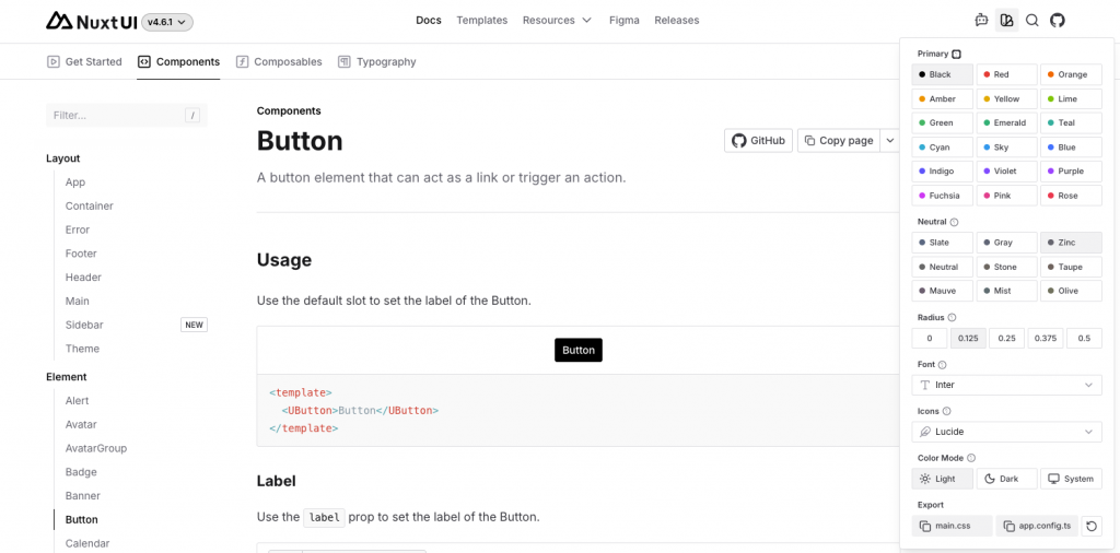
After choosing your settings, copy the theme configurations. Use the main.css and app.config.ts buttons under the Export section of the popup.
Next we need to paste these snippets into the corresponding files. For my demo, I chose a basic black/white theme:
@import 'tailwindcss';
@import '@nuxt/ui';

@theme {
  --font-sans: 'Inter', sans-serif;
}

:root {
  --ui-radius: 0.125rem;
  --ui-primary: black;
}

.dark {
  --ui-primary: white;
}
export default defineAppConfig({
ui: {
colors: {
primary: 'white',
neutral: 'zinc'
}
}
})Building A Demo App
Next, we will start shaping the actual markup of our page. Since we are working with NuxtUI, we do not have to build everything from scratch. Instead, we rely on prebuilt components for a visually appealing setup. Combining these elements creates a clean, functional layout. This approach lets us focus on structure and behavior rather than early styling details.
app/app.vue is the entry point of our application. It wraps everything in NuxtUI’s UApp component for structure. This combines the header and dummy content into a complete layout.
<template>
  <UApp>
    <!-- Our theme switch will be in AppHeader -->
    <AppHeader />
    <UMain>
      <UContainer>
        <!-- Our dummy page content will be in AppContent -->
        <AppContent />
      </UContainer>
    </UMain>
  </UApp>
</template>
app/components/AppContent.vue is responsible for rendering the main placeholder content of the page. NuxtUI’s UPageHero creates a visually appealing section. This component provides concrete content for our app during development.
<script setup lang="ts">
import type { ButtonProps } from '@nuxt/ui'

const links: ButtonProps[] = [
  {
    label: 'Get started',
    to: '#',
    icon: 'i-lucide-square-play'
  },
  {
    label: 'Learn more',
    to: '#',
    color: 'neutral',
    variant: 'subtle',
    trailingIcon: 'i-lucide-arrow-right'
  }
]
</script>

<template>
  <UPageHero
    title="Level Up Your Themes Using View Transition API"
    description="Make your themes stand out with more than just colors"
    headline="View Transition API + Theme Transition"
    orientation="vertical"
    :links
  >
    <!-- "/pic.png" refers to public/pic.png -->
    <img
      src="/pic.png"
      alt="App screenshot"
      class="rounded-lg shadow-2xl ring ring-default"
    />
  </UPageHero>
</template>
app/components/AppHeader.vue defines the header of the page. This component uses NuxtUI’s UNavigationMenu for a clean navigation bar and houses our theme switch button.
<script setup lang="ts">
import type { NavigationMenuItem } from '@nuxt/ui'

const links: NavigationMenuItem[] = [
  { label: 'Awesome', to: '#' },
  { label: 'Theme', to: '#' },
  { label: 'Transitions', to: '#' }
]
</script>

<template>
  <div
    class="fixed top-2 sm:top-4 mx-auto left-1/2 transform -translate-x-1/2 z-10"
  >
    <UNavigationMenu
      :items="links"
      variant="link"
      color="neutral"
      class="bg-muted/80 backdrop-blur-sm rounded-full px-2 sm:px-4 border border-muted/50 shadow-lg shadow-neutral-950/5"
      :ui="{ link: 'px-2 py-1' }"
    >
      <template #list-trailing>
       <!-- The main star here is the AppThemeSwitch -->
        <AppThemeSwitch />
      </template>
    </UNavigationMenu>
  </div>
</template>
<script setup lang="ts">
// NuxtUI composable which allows us to read/modify theme mode
const colorMode = useColorMode()
// Get next theme based on currently active one
const nextTheme = computed(() =>
colorMode.value === 'dark' ? 'light' : 'dark'
)
// Toggle theme
const switchTheme = () => {
colorMode.preference = nextTheme.value
}
// The main attraction of the theme switching process.
// This function will invoke the view transitions.
const startViewTransition = (event: MouseEvent) => {
// ... but only if the client's browser support this API!
// Otherwise we will just do an instant theme switch.
if (!document.startViewTransition) {
switchTheme()
return
}
// Invoke view transition
const transition = document.startViewTransition(() => {
switchTheme()
})
// This piece will handle the theme transitions, by providing
// a callback function that tells the browser how to
// transition/animate between the page views.
// We'll leave it empty for now
transition.ready.then(() => { /* action will happen here */ })
}
</script>
<template>
<ClientOnly>
<UButton
:aria-label="`Switch to ${nextTheme} mode`"
:icon="`i-lucide-${nextTheme === 'dark' ? 'sun' : 'moon'}`"
color="neutral"
variant="ghost"
size="sm"
class="rounded-full bg-def"
@click="startViewTransition"
/>
<template #fallback>
<div class="size-4" />
</template>
</ClientOnly>
</template>
<style>
::view-transition-old(root),
::view-transition-new(root) {
animation: none;
mix-blend-mode: normal;
}
::view-transition-new(root) {
z-index: 9999;
}
::view-transition-old(root) {
z-index: 1;
}
</style>Configuring The Transition Layers
This CSS customizes how the View Transition behaves when switching between states. The browser applies a default animation. We explicitly disable it by setting animation: none on old and new views. This gives us full control over how the transition should look.
The mix-blend-mode: normal rule ensures that both layers are rendered without any blending effects, so colors appear exactly as expected during the transition.
We also control the stacking of the two states. The new view is placed on top using a high z-index, while the old view stays underneath. This layering is vital for defining custom transitions. The new state cleanly covers the old one without any interference.
What We Have Built So Far
Before diving into implementation details, let’s get a visual overview. This preview shows our progress so far. It shows how quickly we can build a polished app. Thanks to NuxtUI, theming support works out of the box. Elements like text and buttons automatically adapt between light and dark mode without any custom CSS.
At the same time, this showcase highlights a limitation of basic theming. The colors update correctly, but the instant switch feels abrupt. Next, we will use the View Transition API for a smoother, more refined experience.

View Transition API In Action
In the following sections we are going to define a set of functions which will take care of the transitions. All of the following functions will be called at the same place, that being in app/components/AppThemeSwitch.vue, specifically, we will pass them as an argument to transition.ready.then(...)
Horizontal Swipe View Transition

export const horizontalSwipeTransition = () => {
  const keyframes = {
    clipPath: [
      // Start fully clipped (nothing visible yet)
      'inset(0 100% 0 0)',
      // End fully visible
      'inset(0 0% 0 0)'
    ]
  }

  document.documentElement.animate(keyframes, {
    duration: 1200,
    easing: 'cubic-bezier(0.76, 0.32, 0.29, 0.99)',
    pseudoElement: '::view-transition-new(root)'
  })
}
This function defines a custom View Transition animation that reveals the new theme with a horizontal swipe effect.
It works by animating the clip-path property, which controls what portion of an element is visible. At the start of the animation, the new view is fully clipped using inset(0 100% 0 0), meaning it is completely hidden. As the animation progresses, the clipping is reduced until it reaches inset(0 0% 0 0), making the entire view visible. The result is a smooth reveal that looks like the new theme is sliding in from the side.
The animation is applied using document.documentElement.animate, which targets the root of the page. The pseudoElement: '::view-transition-new(root)' option ensures that we are animating the new state, not the old one.
Finally, the duration and custom easing curve control the timing and feel of the animation, giving it a slightly more dynamic and polished motion than a standard linear transition.
Lastly, to register this function, pass it as a callback to transition.ready.then in app/components/AppThemeSwitch.vue.
// old
transition.ready.then(() => { /* action will happen here */ })

// new
transition.ready.then(horizontalSwipeTransition)Diagonal Swipe View Transition
export const diagonalSwipeTransition = () => {
  const keyframes = {
    clipPath: [
      // Start as a single invisible point at the bottom-right
      'polygon(100% 100%, 100% 100%, 100% 100%)',
      // Expand into a giant triangle.
      // We overshoot past 0% (to -150%) to guarantee it covers the top-left corner completely.
      'polygon(100% 100%, -150% 100%, 100% -150%)'
    ]
  }

  document.documentElement.animate(keyframes, {
    duration: 1200,
    easing: 'cubic-bezier(0.76, 0.32, 0.29, 0.99)',
    pseudoElement: '::view-transition-new(root)'
  })
}
This transition follows the same idea as the horizontal swipe from the previous section, but changes the shape and direction of the reveal.
Instead of using inset(), it animates a clip-path defined as a polygon. The animation starts as a single point in the bottom right corner, where all polygon coordinates overlap, making the new view completely invisible. From there, the shape expands into a large triangle that grows diagonally across the screen.
The coordinates extend beyond the visible area (to -150%) to ensure the entire viewport is fully covered by the end of the animation. As before, the animation is applied to the ::view-transition-new(root) pseudo element, so we are revealing the new state of the page.
The result is a diagonal swipe effect that feels more dynamic compared to the simple horizontal transition.
Lastly, to register this function, pass it as a callback to transition.ready.then in app/components/AppThemeSwitch.vue.
// old
transition.ready.then(() => { /* action will happen here */ })

// new
transition.ready.then(diagonalSwipeTransition)
Blur View Transition
export const blurTransition = () => {
  const keyframes = [
    {
      // Start: Completely transparent, heavily blurred
      opacity: 0,
      filter: 'blur(30px)',
      transform: 'scale(1.05)'
    },
    {
      // End: Fully opaque, perfectly sharp
      opacity: 1,
      filter: 'blur(0px)',
      transform: 'scale(1)'
    }
  ]

  document.documentElement.animate(keyframes, {
    duration: 600,
    easing: 'cubic-bezier(0.25, 0.46, 0.45, 0.94)',
    pseudoElement: '::view-transition-new(root)'
  })
}
This transition takes a different approach from the previous swipe-based animations by focusing on a soft fade-in effect combined with blur and slight scaling.
At the start of the animation, the new view is fully transparent (opacity: 0), heavily blurred (blur(30px)), and slightly zoomed in (scale(1.05)). This makes it feel distant and out of focus.
As the animation progresses, it smoothly transitions to a fully visible and sharp state (opacity: 1, blur(0px)), while also scaling back to its normal size (scale(1)). This creates a subtle “coming into focus” effect.
Just like the other transitions, it is applied to the ::view-transition-new(root) pseudo element, meaning it only affects the incoming page state during the View Transition.
The result is a much softer and more subtle transition style compared to the directional swipe animations, with a focus on smoothness rather than motion.
Lastly, to register this function, pass it as a callback to transition.ready.then in app/components/AppThemeSwitch.vue.
// old
transition.ready.then(() => { /* action will happen here */ })

// new
transition.ready.then(blurTransition)
Radial-Fill View Transition
export const radialFillTransition = () => {
  const keyframes = {
    clipPath: [
      // Start: tiny circle at top-center (0% X, 0% Y)
      'circle(0% at 50% 0%)',
      // End: large circle covering entire screen
      'circle(150% at 50% 0%)'
    ]
  }

  document.documentElement.animate(keyframes, {
    duration: 1200,
    easing: 'cubic-bezier(0.76, 0.32, 0.29, 0.99)',
    pseudoElement: '::view-transition-new(root)'
  })
}
This transition creates a radial-fill effect using a circular clip-path.
It starts with a circle of radius 0% positioned at the top-center of the screen (50% 0%), which means the new view is completely hidden at the beginning. From there, the circle expands outward until it reaches 150%, which is large enough to cover the entire viewport.
By growing the circle from a single point into a full-screen shape, the new page reveals itself from a central origin at the top. This gives a more organic, spotlight-like transition compared to the directional swipe or blur effects shown earlier.
As with the other examples, the animation targets ::view-transition-new(root), so it only affects the incoming state during the view transition process.
Lastly, to register this function, pass it as a callback to transition.ready.then in app/components/AppThemeSwitch.vue.
// old
transition.ready.then(() => { /* action will happen here */ })

// new
transition.ready.then(radialFillTransition)
Conclusion
What makes the View Transition API so compelling is not just that it enables smoother animations, but that it turns what used to be a hard boundary on the web into something expressive and intentional.
Instead of treating theme switching as a binary toggle between light and dark, the API lets you design it as an experience. A simple preference change becomes a moment of continuity: colors, surfaces, and hierarchy can gently morph rather than abruptly snap. That subtle shift has an outsized impact on perceived quality. Users may not consciously notice why the interface feels better, but they feel it.
Beyond theme transitions, the real strength here is control with minimal complexity. Where brittle DOM hacks, animation libraries, or layout gymnastics once reigned, a few declarative hooks now handle the job. That means less code to maintain, fewer edge cases, and more room to focus on the design itself rather than the mechanics of animating it.
And perhaps most importantly, the API pushes the web further toward something it has always been good at, fluidity. Pages are no longer just destinations that reload or replace each other. They can behave more like a continuous surface where change is part of the experience, not a disruption.
Theme transitions are just one demonstration, but they hint at a larger shift: a web where state changes feel designed, not merely implemented.
Get in touch
At N47, this kind of attention to frontend craft is part of how we build digital products end to end. If you’re working on a web application and want a team that sweats the details, get in touch — we’d love to hear about your project.


