As a developer, the most important aspect of your app is the user experience. No matter the type of software you are creating, it is very important that it can be easy to use and accessible to everyone. Especially the app you are developing is meant to be used by the elderly or users with disabilities.
This post won’t contain any detailed technicalities as to how to achieve good accessibility since there are already countless of blogs and websites that cover this topic in great detail. Its purpose is to cover the various topics that are important to achieving proper accessibility within your app. And with that, let’s start with the very basic.
What is accessibility in iOS?
In its most basic form, accessibility in software products is to allow everyone proper access and options to use your software no matter their disability. This covers visual, auditory impairments, as well as physical disabilities. It is important to leave the flow unobstructed and have every part of the app reachable as it’s intended for the default experience.
Initially, iOS already offers great out of the box functionalities to assist with achieving proper accessibility. As a developer, the important part is to make your app compatible with said functionalities. In some cases, it is also required by law to make your app accessible if the target audience for the app is a group of people that could have certain disabilities.
Additionally, Xcode offers the Accessibility Inspector which you can use to test out all of the UI elements and see if they are compatible with the necessary accessibility options.
Let’s first cover what iOS offers for accessibility that we would need to pay attention to.
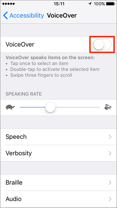
Voice Over
The functionality of VoiceOver is to offer users certain gestures and voice-assisted tools to navigate through an app. These are easy to learn features that can greatly enhance the experience for users with disabilities.
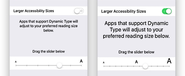
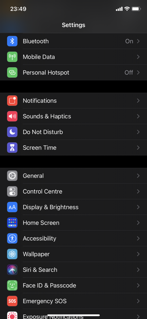
Display & Text Size
Display & Text Size helps with scaling up the UI of the app to make the text larger and easier to read. Both of these features are very important to complete the full experience for all users.
Now, let’s cover the basic topics to make your app accessible
Scalability
As previously mentioned, some of the native functions help with adjusting the look of the app so its elements are larger and easier to look at. One of the steps to ensure that is making sure that almost every screen in the app has an embedded scroll view. Even if a certain screen might only contain a single label or a button or two, the scalability options push the boundaries so far that it will need the necessary space to fill in the data.
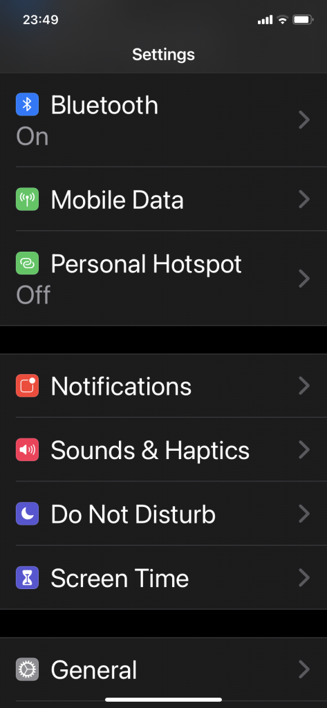
As you can see in the example above, the difference is substantial. This is why when dealing with accessibility it’s important to avoid using fixed width and height on your UI elements (with minor exceptions). Because otherwise you will experience text truncating and cut off content.
Design
Considering the latest trends in app design, everyone thrives for simplicity. While this is also true for accessible apps, it is also important to either make some exceptions or bring down the simplicity even further depending on the content of the app.
It is especially important not to clutter the screen with too much labels/buttons on a horizontal scale. Since the UI needs to scale up, you need to provide enough room for everything to be displayed.
One thing to note is that sometimes the scalability might break some design rules that you have about the app, but that’s completely fine. As long as everything can be accessible at all possible points, there can be some exceptions regarding that.
Text
The default font provided by Xcode already is capable to work with scalability within the app. It’s also a good reminder that the font of choice within your app is easy to read no matter the size.
Also, it’s advised to use the regular and/or larger font weights compared to Thin, Ultrathin and Light that can be harder to see.
Additionally, if there are any visuals in the app that contain text in images, if possible it’s better to adjust the design to have all of the text in native labels so the VoiceOver can read them out for the user.
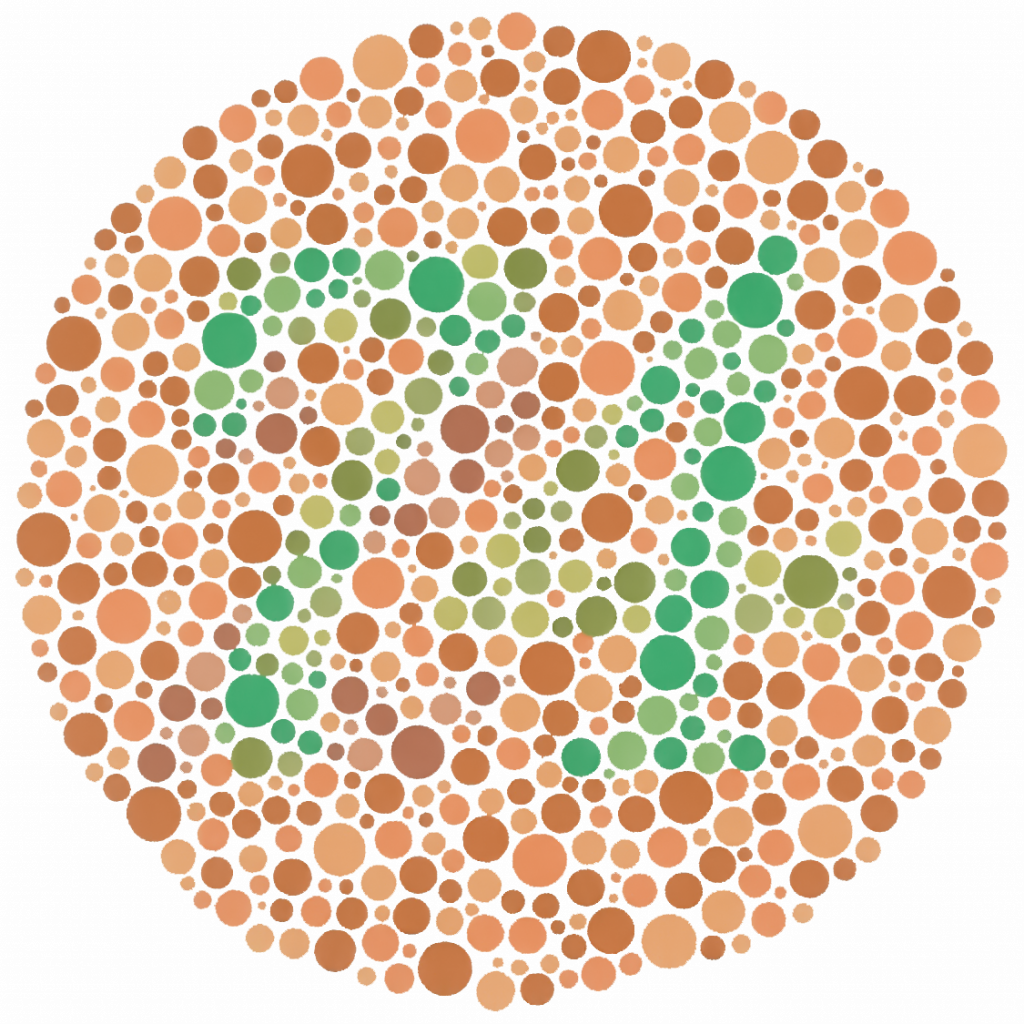
Colours
On this topic, the most important part is to use a combination of colours that contrast each other to ensure that the content is properly viewable for everyone. In its most basic form, this is usually text against a background. In some cases, you might have to pay attention to colour choices for users with colour blindness. There are various tools to compare the necessary contrast.
Accessibility hints and labels
All of the UI elements that you can use in Xcode that the users can interact with can have some sort of accessibility info added on them. This is important so the users can know what do those elements convey. Especially on images, where you can provide all the details about what the images contain. You can also add hints on buttons, so the user knows what action would a certain button do prior to pressing it.
Conclusion
In general, the topic of providing access to your apps is not an easy thing to achieve. It requires proper setup with consideration of many aspects to ensure that all users can freely use your app without any hiccups. Luckily, Xcode provides all of the necessary functionalities to create and test all of the accessibility options. As mentioned at the start, there are plenty of tutorials that cover this topic in great detail with all of the technicalities. So hopefully this will guide you in the right way to achieve that!