Why designers should care about Gestalt principles?
Great designers understand the powerful role that psychology plays in visual perception. What happens when someone’s eye meets your design creations? How does their mind react to the message your piece is sharing?
— Laura Busche, Brand Content Strategist at Autodesk
Think about that quote for a minute. When people first see your designs, how do they experience them? Communication plays a central role in both the user interface and user experience design. Understanding how your users perceive and interpret with your work is key to understand what makes UI design work, you need to understand the psychology of human perception.
In the 1920s a group of German psychologists developed theories around how people perceive the world around them, called Gestalt principles. The fundamental law that governs a Gestalt principle is that our minds tend to perceive objects as part of a greater whole, we tend to order our experience in a manner that’s regular, orderly, and recognizable. This is what allows us to create meaning in a complex and chaotic world.
Over the last two decades, the work of Gestalt psychologists has been adopted by designers involved in the development of products for human use. The implementation of Gestalt principles can greatly improve, not just the aesthetics of a design, but also its functionality and user-friendliness, and are a valuable set of ideas for any designer to learn.
There are six individual principles commonly associated with Gestalt theory: similarity, proximity, continuation, closure, figure/ground and symmetry & order. There are also other additional, newer principles sometimes associated with Gestalt, such as common fate.
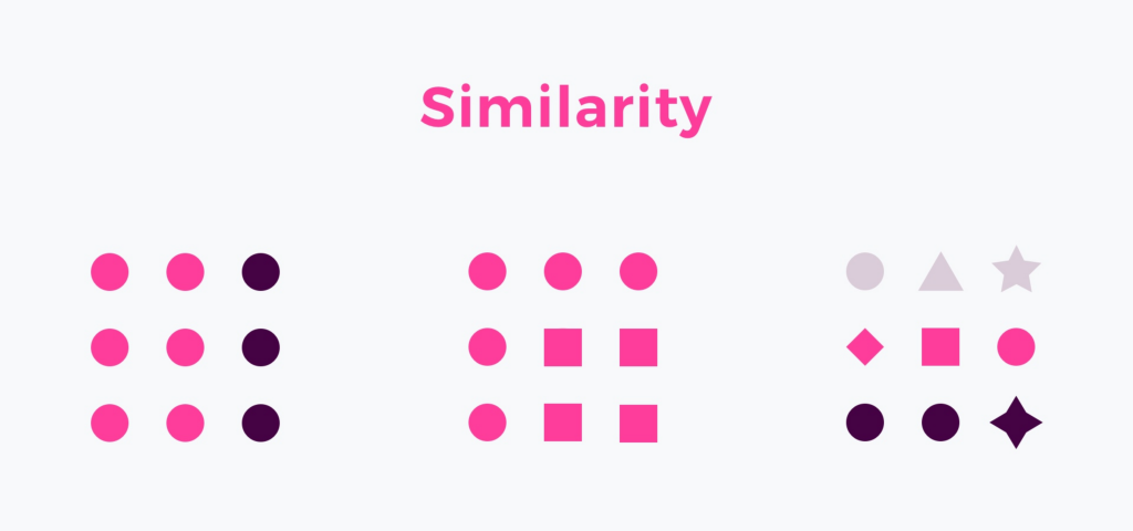
Similarity
The principle of similarity states that when things appear to be similar to each other we group them together. And we also tend to think they have the same function.
Elements that have similar visual appearance seem to be more related or grouped than the ones not sharing the same attributes.
The main characteristics that boots the impression of similarity are size, shape, and colour.
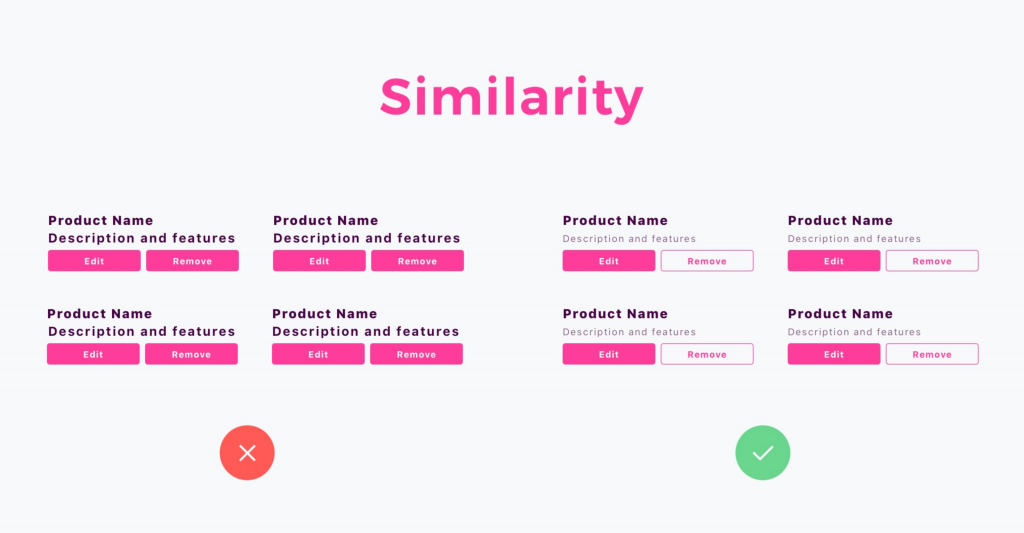
Similarity Principle – How is it used in UI Design?
While 3 mentioned attributes perfectly apply to the UI Design, there are also additional, not so atomic properties, that may strengthen the similarity: typography, iconography, shadow, texture, etc.
When users notice similar elements in the user-interface they categorize them as particular patterns. Thanks to this they quickly recognize the meaning of specific UI controls. This is why it is so crucial for the primary buttons to look the same on every page. In the group of similar elements, we tend to see objects with the similarity of colours first then size and in the end shape.
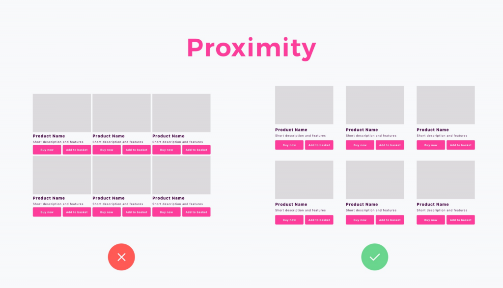
Proximity
The principle of proximity tells that people group objects that are visually closer to each other. Even if there are more objects, the ones that are closer seems to be more correlative than elements that are placed farther. This principle is so essential to our perception that it is stronger than other features like shape or colour.
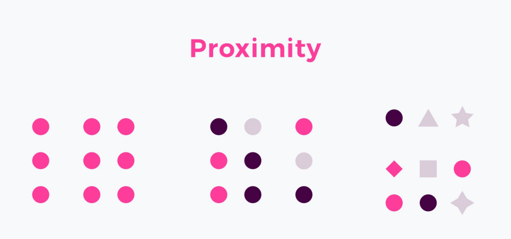
Proximity Principle – How is it used in UI Design?
Thanks to the usage of proximity web designers can create content more comfortably to perceive by users. The pages are more scannable. This principle is applied not only to the UI elements (buttons, inputs, etc.) but also to the written content and typography of the solution. The proximity is bonded with white space that plays an essential role in this principle. It boosts the relations between elements and strengthens the designer’s intention. With this users have no doubt what will happen if they trigger the action.
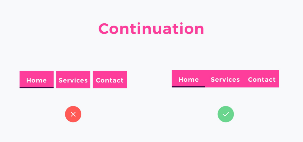
Continuation Principle
When the eye is guided to move from one object to another, we speak about the law of continuity. Our perception tends to see objects arranged in lines or curves as more related or grouped.
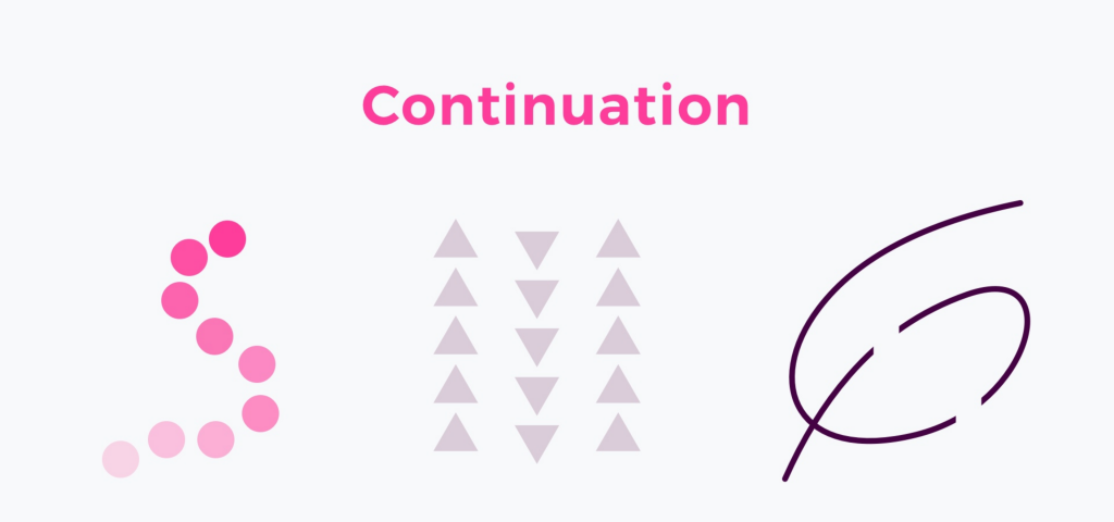
Continuation Principle – How is it used in UI Design?
When you see groups of elements, like player track, photo gallery sliders, tabs or even simple lists, you may now notice that are using continuation. The objects are places nearby, and they guide eyes to jump from the one to the next.
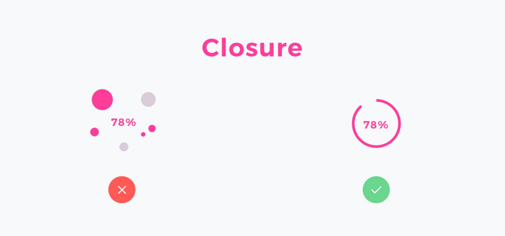
Closure
The principle refers to the statement that objects are often perceived as a whole thing, even when they are incomplete. Our mind quickly fills the gaps and helps us to find the meaning of a particular thing. In other words, when you see an image that has missing parts, your brain will fill in the blanks and make a complete image so you can still recognize the pattern.
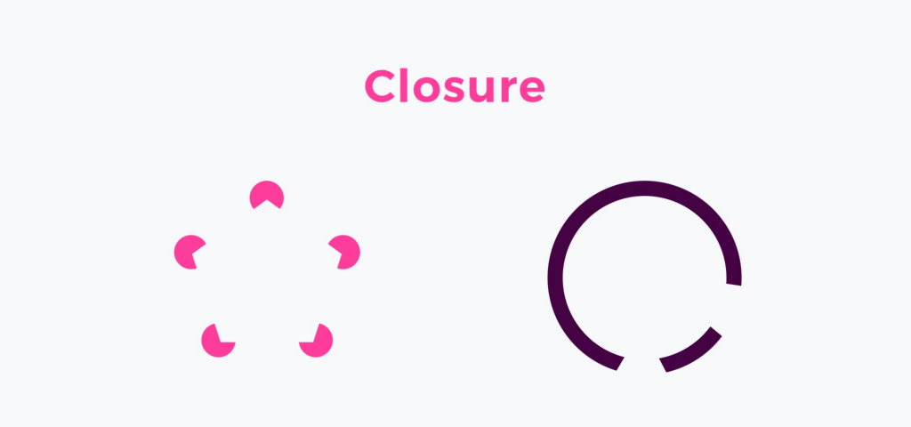
Closure Principle – How it is used in UI Design?
Every day we see the effect of this principle in the logos and icons. Every loading indicator, a progress car or slider – the law of closure was used to make the solution more understandable to the user. The other usage in the web of closure is negative space.
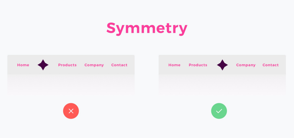
Symmetry Principle
Symmetry states that the viewer should not be given the impression that something is out of balance or missing or wrong. We perceive symmetrical objects as part of the same group. They create an impression of stability and order.
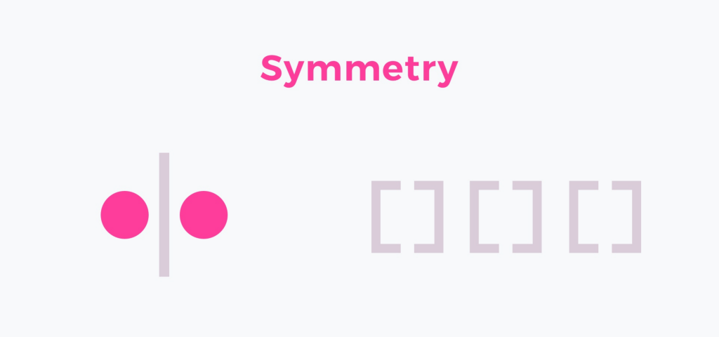
Symmetry Principle – How is it used in UI Design?
UI elements that are symmetrical to each other help to scan the content and recognize patterns. Symmetry allows users to focus on what is essential. Symmetrical navigation menus tend to be perceived as more stable. The principle is excellent to use when you design galleries or banners. On the other hand, some asymmetry in design can make it more exciting and dynamic.
Common Fate Principle
The idea of “common fate” is simple. We perceive items or objects moving (or appearing to move) in the same directions. Those related items are sharing a common fate.
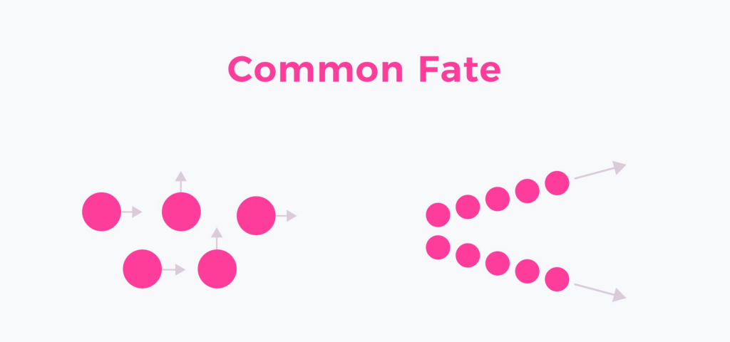
Common Fate Principle – How is it used in UI Design?
This principle is fundamental in motion design. Every meaningful animation uses common fate to guide the user’s eye in the right way. This helps to connect content with triggered action. Common fate also applies to the elements like nested menus, dropdown or accordions, that show how the menu elements will behave clearly.
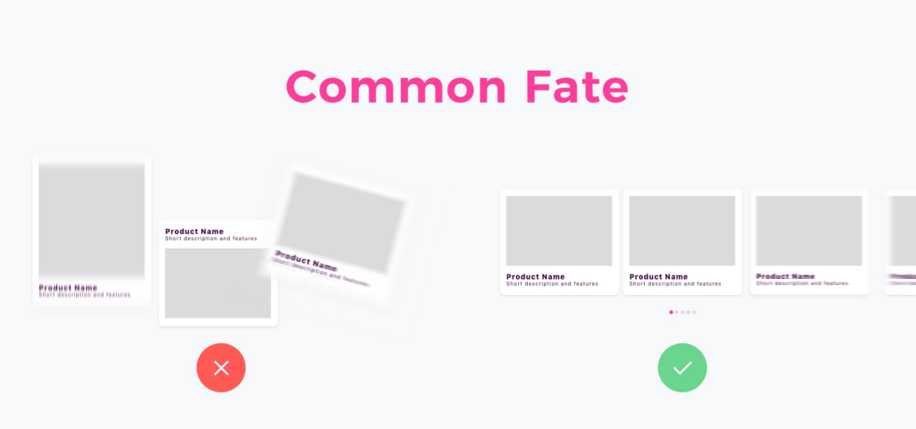
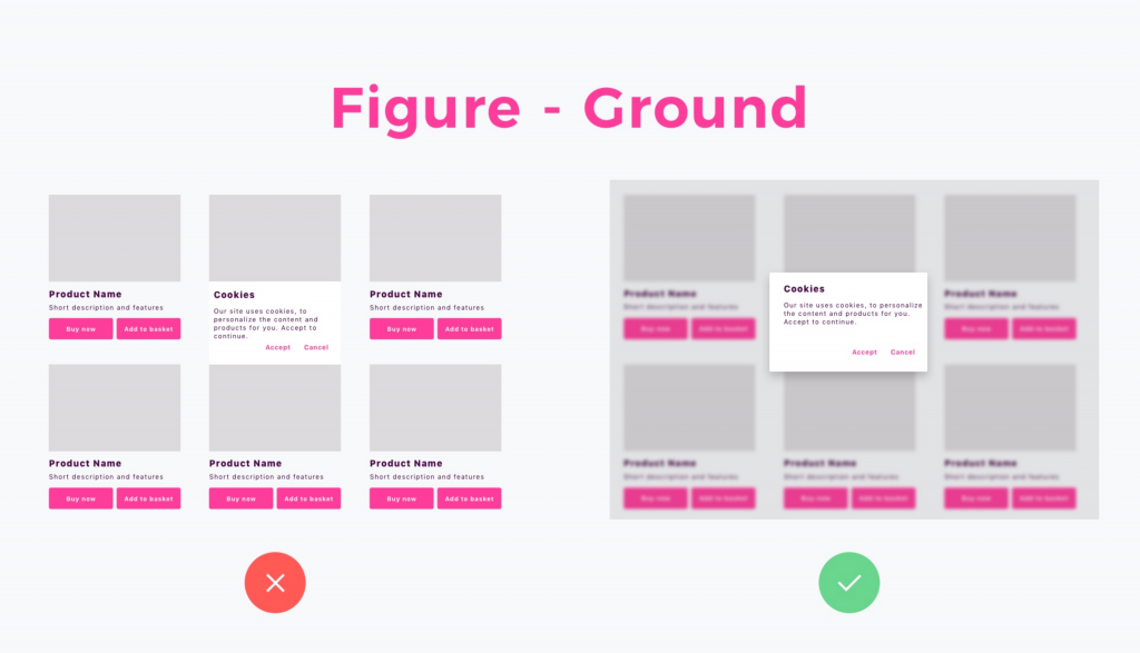
Figure-Ground Principle
The human eye is able to separate objects on different plans of focus. This principle states that people instinctively perceive objects as either being in the foreground or the background. They either stand out in the front or recede into the back.
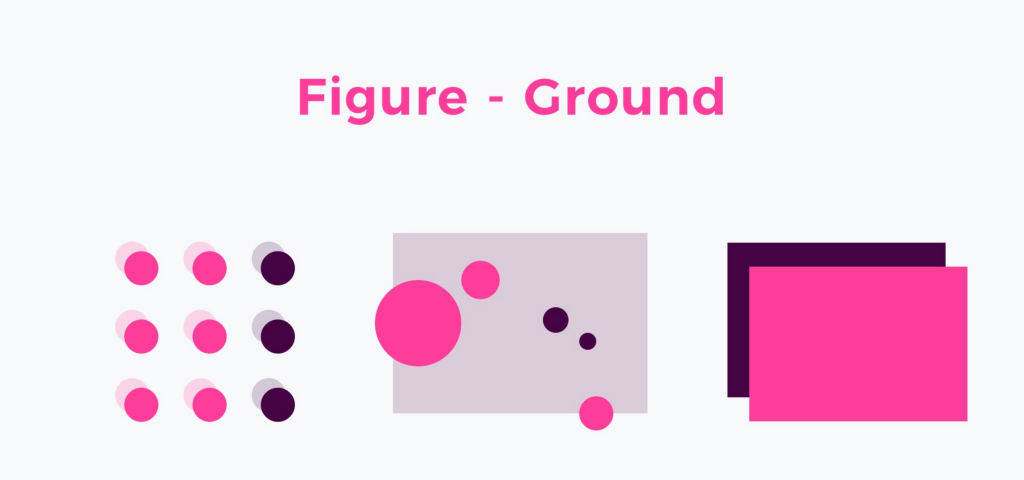
Figure-Ground Principle – How is it used in UI Design?
Every time you see the modal page or popup you are a witness of Figure-Ground Principle usage in action. There are several techniques to distinguish plans of focus on mobile: you can use parallax background, semi-transparent overlay, shadows or blur the elements in the background.
There are design systems that prefer each technique to be used in them: Material Design uses overlays and drops shadows, but iOS Human Interface guidelines recommend to use blur.
Wrapping up
These principles help take the guesswork out of design. If applied correctly, they can provide you with some quick wins out of the box. By employing these psychological tenets, designers and non-designers can understand why they make certain decisions and better predict how audiences will perceive various elements.