When working on the new design in order to provide a quality experience for your users, it is essential that you pay attention to the design principles. Consistency is a golden rule in web design for both visual elements and functionalities.
One of the easiest ways to control the structure of a layout and to achieve a consistent and organizes design is to apply a grid system. Proportion, rhythm, white space and hierarchy are all design characteristics that directly affect the perceived speed. Grids create and enforce the consistency of these elements throughout an interface. The effective grid guides the eye, making it easier and more pleasant to scan objects on the screen. This is especially important in digital products because they are functional, meaning that people use the products to complete specific tasks, such as sending a message, booking a hotel of paying the bills. Consistency helps the viewer understand where to find the next piece of information or what step to take next.
Grids connect and reinforce the visual hierarchy of the design by providing a set of rules, such as where elements should go in the layout. In most basic terms, the grid is like an invisible glue that holds a design together. Even when elements are physically separated from each other, something invisible connects them together.
The grid system helps align page elements based on sequenced columns and rows called modules. We use column-based structures to place text, images, and functions in a consistent way throughout the design. Every element takes its place that we can see instantly and reproduce elsewhere. Basically, the grid serves as the framework for the page’s layout. Think of it as a skeleton on which a designer can organize graphic elements in an easy-to-absorb way.
Applying a grid system is a tried and tested technique that first found favour in print layout. The grid system was first used to arrange handwriting on paper and then in publishing the layout of printed pages. Given that the printed page and the virtual page have much in common, it should come as no surprise that we also use in the web and app design. Because browsers handle information differently, and screens vary in size creating a grid system for the virtual page is a little more complex than the physical page. However, the principle remains the same.
Anatomy of grid
Whether simple or complex, all grids have some common parts:
Format
The format is the area in which the design is placed. In the paper book, the format is the page. On the web, the format is the size of the browser window.
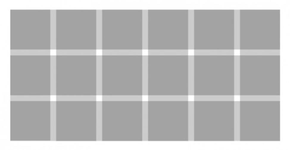
Columns
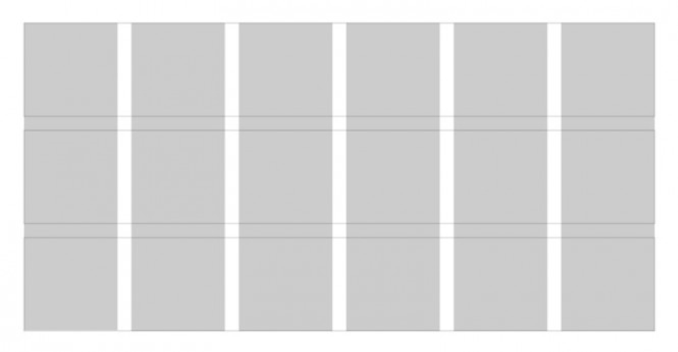
Columns are building blocks of grids. Columns are the vertical sections of the grid. The more columns in the grid, the higher it’s flexibility.
Rows
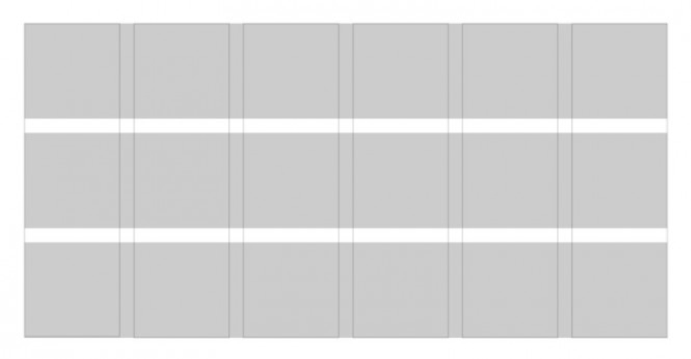
Rows are horizontal sections of the grid. In web design, they are often neglected. Grids with rows and columns are called modular grids.
Modules
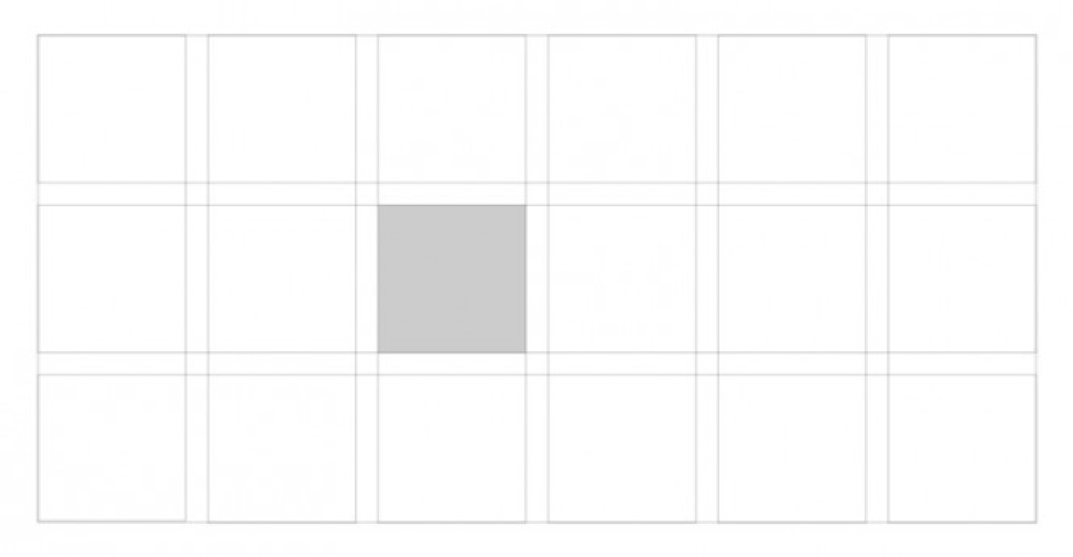
Modules are individual units of space created from the intersection of columns and rows (i.e. the horizontal equivalents of columns)
Areas
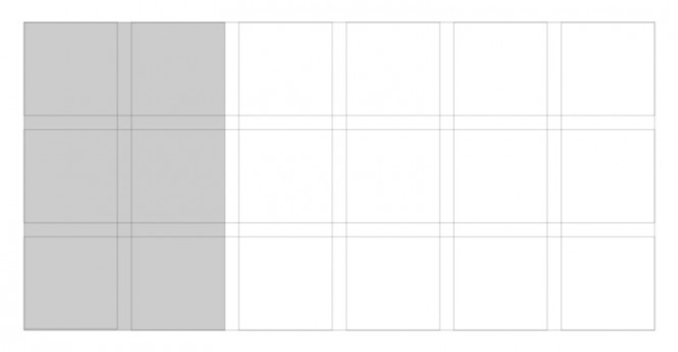
Areas are a group of columns, rows or modules that form an element of a composition.
Gaps
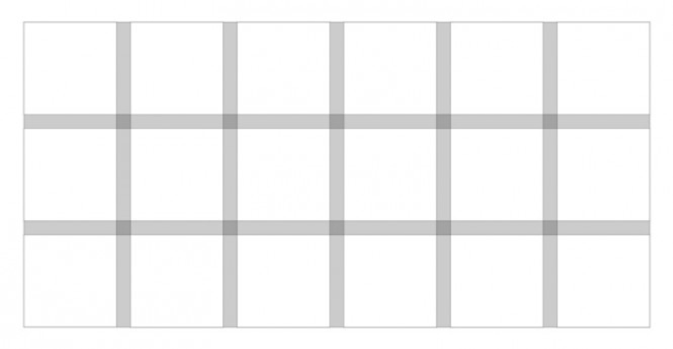
Columns and rows are separated by gaps. The thinner the gap, the greater the visual pressure created. Grids with wide gaps form calm, comfortable layouts since the elements of the composition are more freely located relative to each other.
Borders
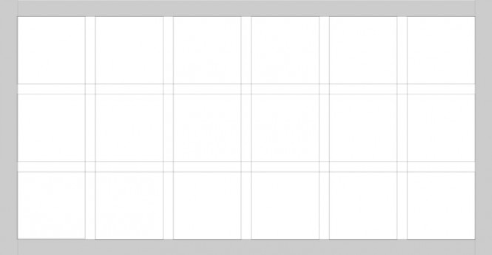
Borders are the space outside the grid columns and rows. Do not confuse borders with indentation, which is the space inside rows and columns.
Production lines
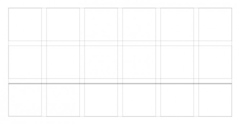
Flow lines are commonly used to break up sections of a composition. They form the starting and ending positions in the design.
Grid Types
Columns, modules, gabs, and margins can be combined in a different way to form distinct types of grids. Below are four standard layout grids:
- Manuscript grid
- Column grid
- Modular grid
- Baseline grid
Manuscript grid

A manuscript grid or a single column grid as it’s often called the simples grid structure. It’s essentially a large rectangular area that takes up most of the space inside a format. Manuscript grids are good for continuous blocks of text. However, they aren’t limited to text; images can be used to fill the blocks. Given the name people naturally, associate manuscript grid with printed pages.
Multicolumn grid

The column grid is by far the most commonly used type of grid in web design because the screen width is finite, unlike the height that can unfold infinitely if the user has the ability to scroll. Most of the column grids used on the web are 12-column ones, but this should not stop designers and developers from looking for alternatives. The more columns you create the more flexible your grid becomes. Column grids are useful for layouts that contain discontinuous information.
Modular grid
While a multicolumn grid splits a page vertically into a number of columns, a modular grid subdivides a page both vertically and horizontally into modules. The columns and rows are the gaps between them create a matrix of cells or modules. Modular grids are good when you require more control over a complex layout then a column grid can offer. A modular grid provides flexible formats of pages and allows you to create a complex hierarchy. Each module in the grid can contain a small chunk of information, or adjacent modules can be combined to form blocks. This type of grid is popular in digital media for different devices that are built on the basis of the card interface.
Hierarchical grid

A hierarchical grid is an intuitively constructed grid that focuses on the proportions of the elements in the design. This type of grid is often used when content is not standardized and monotonous. They are not arranged according to rows or columns. Hierarchical grids do not have equal spaces between the modules. So basically, it can consist of rows as well as columns, often overlapping each other, thus creating more scope for content and creativity.
A design that is poorly put together will make the product seem less usable and trustworthy. Grid usage in our design can take us one step further away from this scenario.


